Ah, the close of a year and start of another. A time to reflect and plan, and pick out those things that you hope to do in the coming trip around the sun.
In truth, very few people orient their lives around goals. But there is great power in naming, documenting, and planning out what you hope to achieve.
And so, the following 4 items are the things I hope to achieve in 2014.
Write 4 or more blog posts per quarter.
Create 3 or more training courses for WintellectNow.
Give 2 or more talks at user groups and Code Camp
Start 1 podcast.
Action
If writing down goals were enough, we’d no doubt all be highly successful professionals. But action is required. I find that in order to be effective at moving towards my goals, I have to form a specific action plan that breaks out the endgame in to a series of measurable steps. Think of it like wanting to save $1,000. Will you be more successful if you set up an automatic draft that pulls $83.33 a month in to your savings account, or if you try to cram $1,000 worth of margin in to December’s budget? Here are some tips I use when creating action plans.
Look for equally sized units of effort
Just as in our savings example above, if you can break you goal in to equally sized steps, you may find them easier to achieve over and over, since after the first few times you’ll know what to expect.
Use your calendar
As a husband and parent, I have a finite amount of free time to work on extra-curricular professional development and hobbies. Add to the mix other activities like Netflix or hanging out with the guys, and the ability to routinely make progress can be easily thwarted. One method that my wife and I have adopted is to plan out the week ahead and agree on what nights we’ll watch TV, which nights will be used for individual projects, and what nights we have plans with others. This way, I know in advance when my working hours will occur, and I can prepare accordingly. Also, it helps avoid spousal neglect syndrome since we’ve pre-planned when we’ll each do our own thing.
Chart and share your progress
Studies have shown that sharing your progress and results with others can have a significant impact on the success of reaching your goals. As part of your action plan, identify the key items that can be reported out to a spouse, colleague, or friend. Invite them to hold you accountable to achieving your goals, and that inner pressure to impress will drive you towards results.
Goals are more than quick wins. They are the path to personal growth. So, raise a glass tonight to toast in the new year, but start tomorrow with a plan.
This weekend I had the distinct privilege of speaking at Raleigh Code Camp. This was a great day of technical sessions, meeting new people from the local .NET development community, and presenting. I want to thank all the planners and volunteers from TriNUG who put on an awesome day.
Here is a video of my presentation about using PhoneGap and Asp.Net WebApi to build data-driven mobile apps.
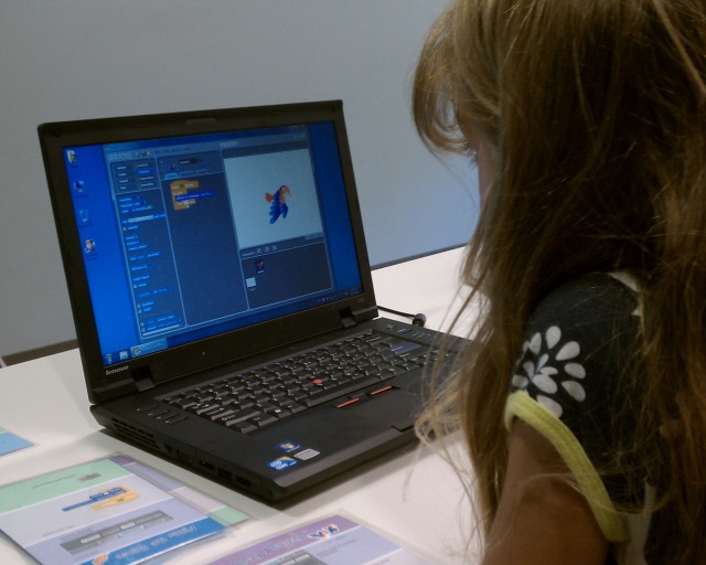
A few weeks ago I took my six year old daughter to a Scratch workshop at our local public library. I had heard about Scratch, but had not really seen it in action, and was very curious to see how my kid would take to it.
The workshop leader gave a very brief intro to the platform and did a simple sample program to get us started. He also had printed out the learning cards from the Scratch website, which give various samples and the specific code blocks to use to complete them.
By the end of the hour, we had implemented and adapted the program from one of the tutorials to make a picture of a cat chase a picture of a fish, and play a ‘meow’ sound whenever it ‘caught’ it. My daughter had a lot of fun, and now has added ‘can I play Scratch’ to her list of tech related requests, after 1. Can I watch a movie? and 2. Can I play on the iPad?
For those who may not be familiar with it, Scratch is a project from the MIT media lab. There is a great TED talk about its origins. The user interface is at the same time kid friendly and sophisticated.
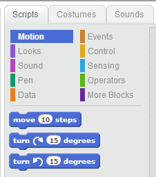
Programming in Scratch involves selecting a sprite and assembling a list of commands by dragging-and-dropping them on to a program canvas. The commands are color coded, and snap together Lego-style. You can have multiple sprites, and all the basic programming constructs are there, including conditions, loops, variables, events, and properties.
While Scratch is one of a growing number of platforms intended to introduce children to programming, it makes me wonder if it is the future of programming. Given that a whole generation of kids may grow up using Scratch, and consequently think that programming is a drag-and-drop, snap-together experience, I wonder if they will be disappointed to know that in real life, programming is a lot of typing.
I have a lot of respect and admiration of Andrew Hunt and David Thomas, authors of The Pragmatic Programmer. One of their tips is simply “Write Code That Writes Code”. They liken code-generators to templates and jigs used by woodworkers to use for repeated tasks. In some regard, Scratch is a code generator, in fact, quite a dynamic one. The click-together code blocks abstract out the core usage into a simple UI based entity, suitable for even a 6 year old to comprehend.
As a professional developer, I have always had a love-hate relationship with code generation tools. Part of me is a purist, wanting to write and own my own code, line by line. Part of me sees the HTML generated by Microsoft Word and wants to throw up. I have always held that writing code and gaining the experience and understanding of what is really going on is more valuable than just getting something generated quickly. But would I be happier to be able to quit typing line after line and instead drag-and-drop blocks on to the canvas? Would I feel in control enough of the output to appreciate the simplicity and convenience that the canvas offers?
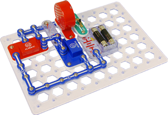
A more tangible analog to Scratch in the physical world are SnapCircuits. This ingenious kit allows kids to design and assemble electronic circuits and systems using snap-together components that conduct electricity through the contact points. There are switches, batteries, lights, bells, capacitors, and resistors. Using a underlying grid, you simply assemble the circuit by placing and connecting the individual parts. All the realities of electronics are there, just in a kid-friendly mode. Ohm’s law holds true for SnapCircuits just as it would any other electrical system.
But would you wire a house using SnapCircuits? Would we want to, given the chance? Wrapping wires around screws has worked for decades, right? Are these ‘snap-together’ systems only suitable for children?
If a system or new code-writing methodology would let me as a developer build systems faster, then there certainly is value to that. But are we too ‘mature’ to consider ‘kid-friendly’ methods as the way to achieve those gains? Perhaps my daughter’s generation will demand that shift, and they’ll have the bright minds at MIT who created Scratch to thank for it.
Recently, a fair amount of media attention has been directed at the idea of standing instead of sitting while one works. There are reports showing that sitting kills, and a variety of options for adjustable tables or desktop stands have hit the market.
As a developer who does in fact, work at a desk for the better part of 8 hours a day, I can attest that working while standing does allow me to feel more alert and focused while I work.
So I set off to design and build a sit-or-stand platform for my home office.
Since the file cabinet and desktop setup I constructed for my home office is shared between my wife and I, a free standing desk wasn’t an option. Rather, I needed something that could sit on top of my existing desk, but rise up to standing height when I preferred to work while standing. Since I have both a laptop and additional monitors, a product like the the Furinno laptop stand wasn’t viable, due to its size.
Furinno laptop stand
The next step up is to products like the Kangaroo from Ergotron or the Workfit S by Ergotron. These run between $300 and $600. There are models to support single or dual monitors, or laptop plus monitor in the case of the Kangaroo (shown below). However, the cost of these products was too high for me to justify, and their cubicle style appearance just wasn’t going to have a high enough Wife Acceptance Factor.
Kangaroo Hybrid by Ergo DesktopWorkfit-S by Ergotron
The next option that I found was the Varidesk. It is a freestanding unit that sits on the desktop, with a simple adjustable rise of about 15 inches. But at $300 it was still beyond my budget. Still, the Varidesk inspired my design in its simplicity and mechanics.
Design Criteria
Have a maximum footprint of less than 23 inches (the depth of my desktop)
Have a rise of approximately 12 inches, which would put the platform at about 42 inches in standing mode.
Allow enough space on the desktop to just open the laptop for quick usage.
Avoid permanently attaching or drilling in to the desktop.
Utilize as much scrap lumber and various hardware in the garage as possible.
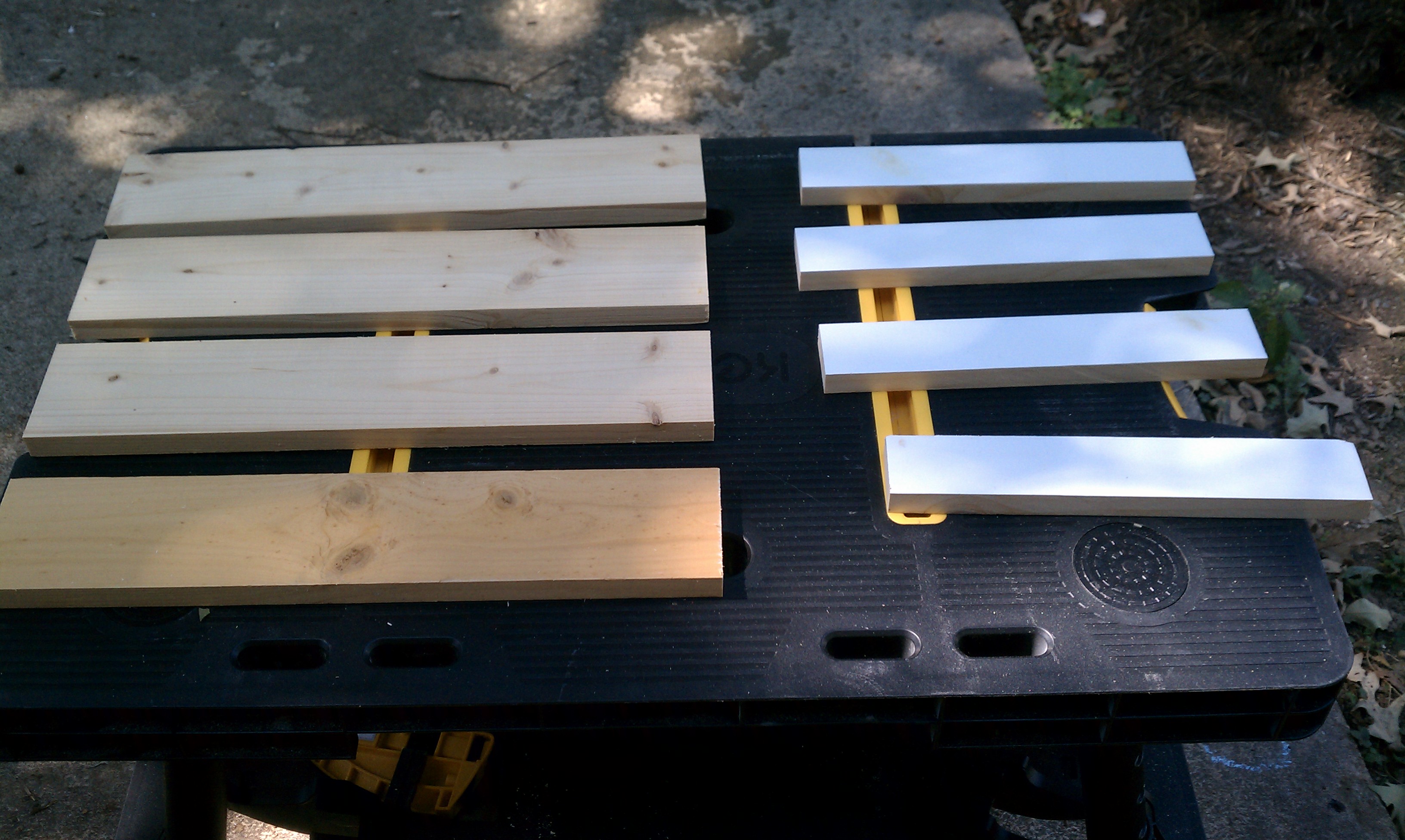
My design would consist of a simple base, a primary platform for my monitor and laptop, with a slide out keyboard tray. I had decent lengths of 1×12 and 1×10 left over from my last project, so I chose them to be the platform and tray. For the base, I would use 1×4 stock, and rip down 1×2 lengths for the supports under the platform.
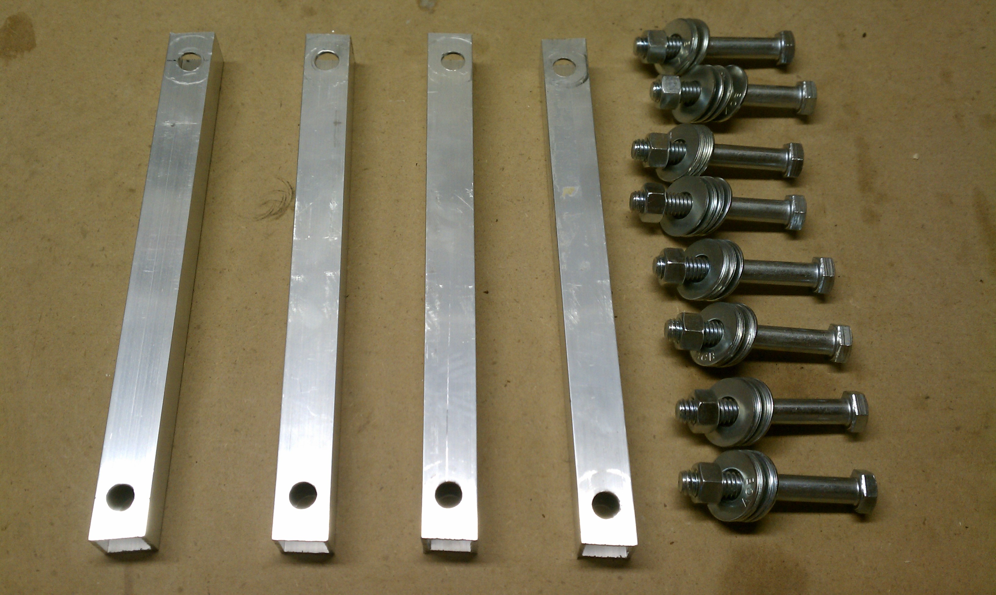
My primary concern was for strength and stability, so I chose to purchase a 3/4″ x 3/4″ square aluminum tube for my supports. This one item was about $12 for a 4 foot length, and represented the bulk of the project’s cost. Steel tube would have been less expensive, and 3/4″ electrical conduit, while round not square, would have been the least expensive option. I preferred the aluminum finish overall and decided to splurge.
For hardware, I used 3/8″ diameter bolts that were 2 1/2″ long. I ended up getting ones that were partially threaded, which turned out to be perfect so the supports aren’t rotating along the threads.
I needed 8 bolts, 8 nuts, and 32 washers. The cost of this hardware was about $10.
I found 12″ deep drawer slides in my garage from a previous project, but if I had to purchase these, they would be $4 or $5.
Construction
After cutting the 1×4 to 18″ lengths for the base, I then ripped down another plank to a true 2″ width. I cut four pieces at 11 7/8″ to go under the platform.
Geometry proved to be the biggest challenge of this project. I knew I wanted the platform to be flush along the back edge, and rotate up to be flush along the front edge, only 12 inches higher.
I first attempted to model this in Google Sketchup, which proved to be a big time sink. While it’s easy to model the boards, getting the rotation arc was hard to do (for me at least).
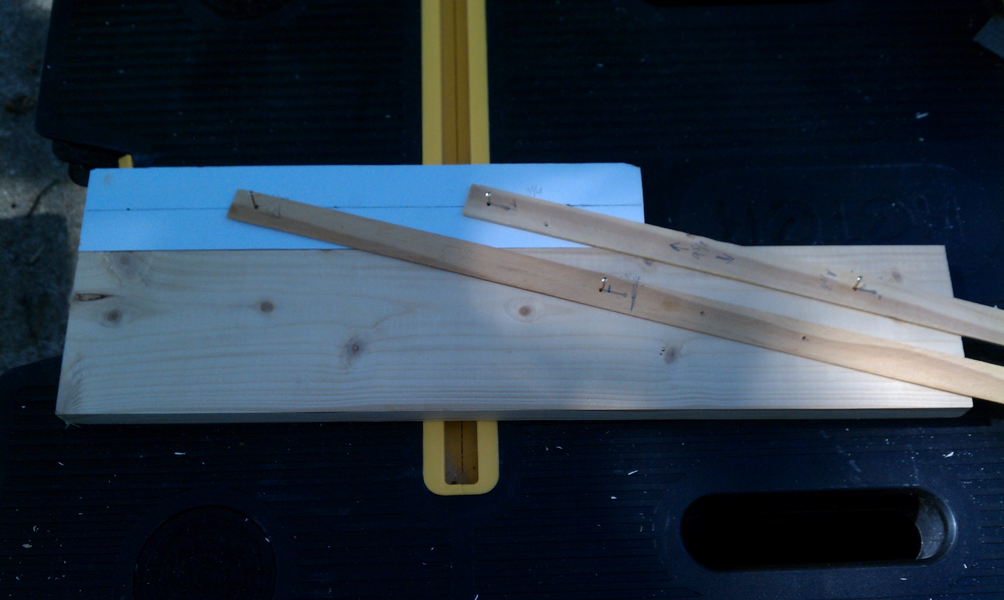
With my actual pieces in place, I decided to just try to mock it up with some thin strips of wood and tacks. My goal was to get the proper length of the vertical supports, and the proper offset for the pivot points in both the base and upper supports. Here’s a picture of my prototype:
After getting what I thought were suitable points, I needed to drill the holes for the bolts and countersinks for the washers. Using a drill press, I first did a 1″ for the countersink about 1/4″ deep. Then I flipped the piece over and did a 3/8″ hole from the other side (to prevent tear-out). I did this for all 8 pieces.
CAUTION: You’ll have to make sure to pair the pieces together and measure from the left on one and the right on the other so the holes match up.
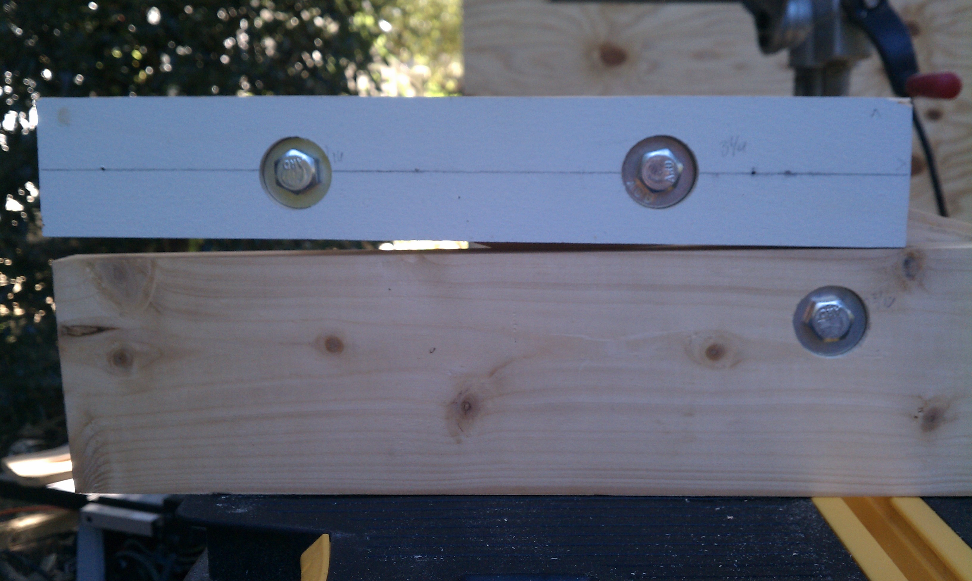
Before committing to cut the aluminum tube, I first used 3/4 x 3/4 wood rods to make sure I got all my measurements correct. It’s a good thing I did, because in fact, I had miscalculated ever so slightly the placement of one of the holes. Consequently, my rotation was off, resulting in the platform not laying flat against the base.
In re-evaluating the measurements, it became clear that I needed both sets of holes to be the same distance apart. There is a form where by the spacing can be narrower on one side, provided that one diameter is longer than the other (a car jack has this arrangement.) But in my case, equal spacing was the trick to keep the vertical supports parallel all along their rotation. On the 2nd pass, the alignment came out much cleaner.
I then cut the aluminum rod using a hacksaw, and carefully drilled 3/8″ holes in each end.
My total width of the platform would be 32″, and the keyboard tray would be 25″. I cut these to length, then used a Kreg pocket hole jig to drill through the upper supports in order to mount them to the platform. Again, I paired the supports so all the pocket holes would be concealed.
Finally, I put a back support across the base to add stability and rigidity, and caps on the front for a clean look.
Stop Blocks and Pins
In order to prevent the platform from rotating all the way forward, I put stop blocks in the base at its maximum height.
To lock the platform in place, I found some surplus Allen keys from some piece of IKEA furniture we’d assembled. I drilled a hole through the base behind each of the rear supports, so that I can insert the pin to hold it in place. (If you wanted to have multiple height settings, you could have several pin locations along the rotation.)
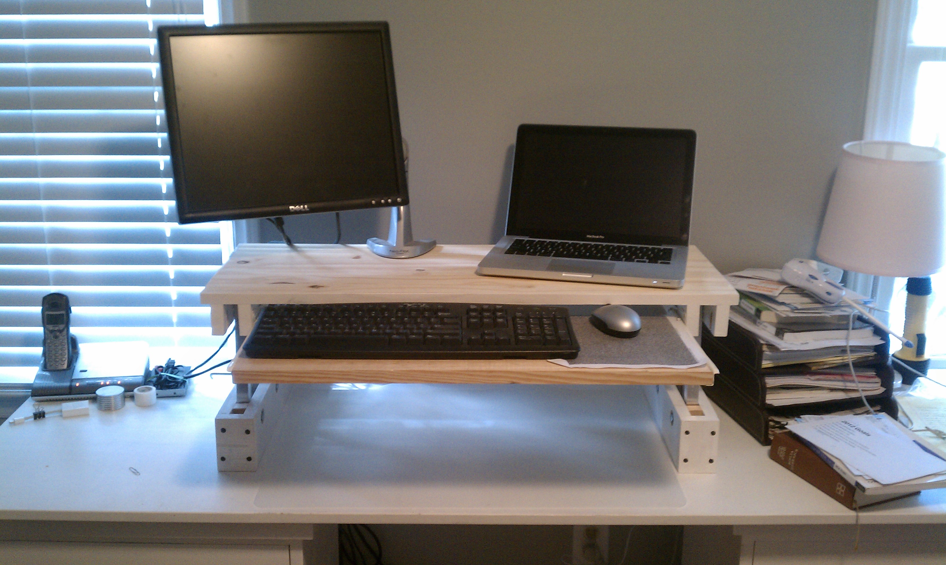
Finally I installed the drawer slides and attached the keyboard tray, and gave the entire unit a coat of paint.
Do you like this design but aren’t interested in building your own? I’m taking orders for pre-made Standing Desks that I’ll build and ship to you. Check out www.freestander.us to learn more and place an order.
Installation
In order to prevent the unit from sliding when I would lift up the platform, I attached two adjustable L-brackets to the base so I could ‘hook’ the unit to the desktop and clamp it down. I used wing-nuts to make it easier to secure when near the wall.
My monitor mount attached nicely to the platform, and gives me plenty of room for either my 13″ Macbook Pro, or 15″ HP laptops. I also added some cable retainers to keep various cables close at hand.
Standing positionSitting position
This project took me two weekends, one for construction and one for painting, but I am totally pleased with the result. I may end up building a second one for my office at work.
UPDATE: Many people have asked for a video showing the operation of the desk, so I have put that together below.
I’ve never been one who particularly cares, or even really notices, the font I use when coding. I’m happy to let someone else make that decision for me. But today on HackerNews there was not one, but two articles about so-called ‘developer fonts’. Suddenly, typefaces for code became a curiosity I had to explore.
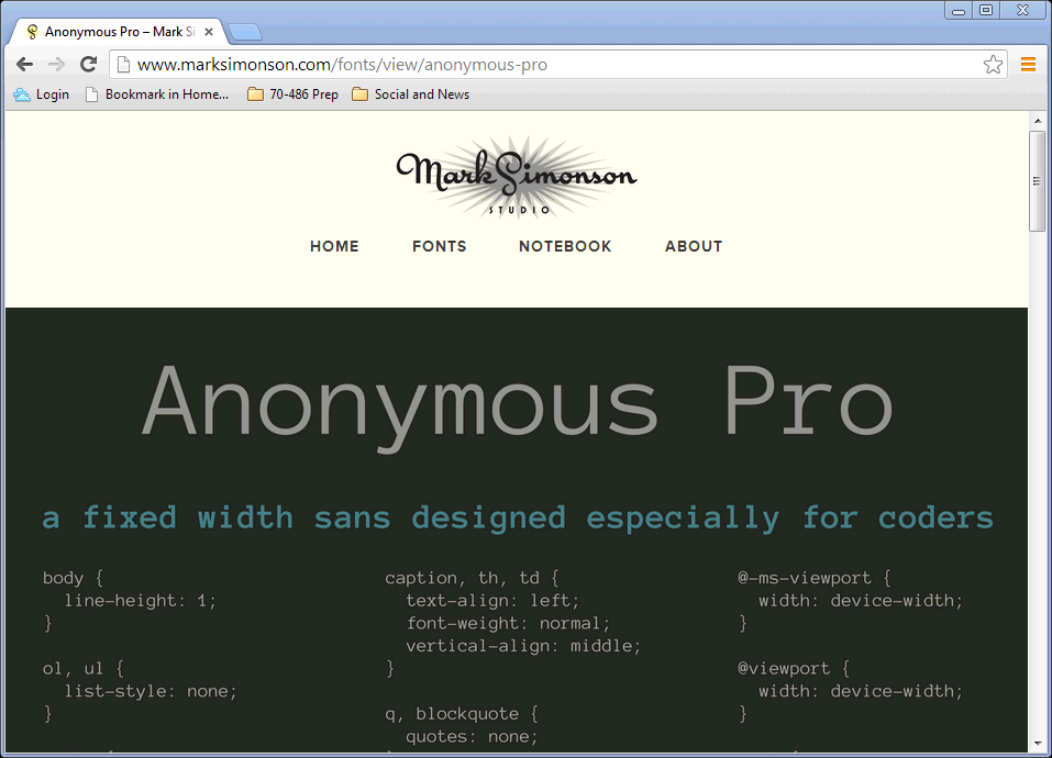
According to its designer, “Anonymous Pro is a family of four fixed-width fonts designed especially with coding in mind. Characters that could be mistaken for one another (O, 0, I, l, 1, etc.) have distinct shapes to make them easier to tell apart in the context of source code.”
Faced with new options, I realized I needed some criteria. What was going to make one font better or worse for coding?
mono-spaced – this is the code-writing font table stakes. It’s hardly a criteria because it is so assumed. However, we will look at how uniform the character size and spacing is, and how that impacts readability.
presentation quality at 1024×768 – needed for viewing on a projector as well as in screencasts
simplicity and style
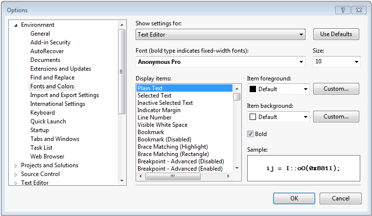
Installing the fonts and setting up Visual Studio
After downloading and unpacking the zip file for Anonymous Pro, installing the four variants (Normal, Bold, Italic, Bold Italic) in Windows is as simple as right-clicking on each .ttf file and selecting Install.
We can then change Visual Studio to use the alternate font. This setting is changed in the Tools | Options dialog on the Fonts and Colors page, as shown below.
It is important necessary to restart Visual Studio after making this change. (It was for me at least!)
Everyday Use
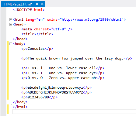
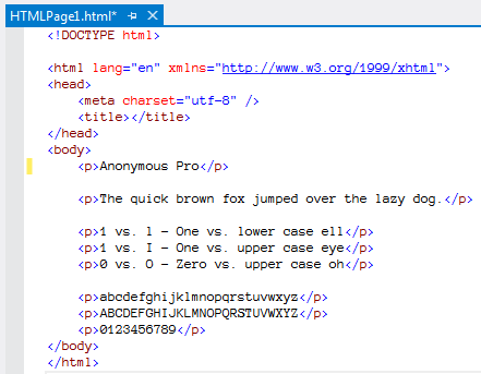
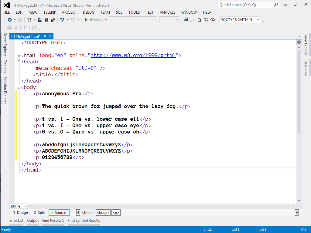
Now we’ll see how this new font shows by creating a new html page. For reference, here is the Consolas 10pt code file first, then Anonymous Pro 10pt.
A few details jump out right away.
Both fonts cross the zero to distinguish it from the letter O.
Both fonts distinguish 1 from l by angling the top stroke.
The lower case ‘s’ in Anonymous Pro appears a bit ‘squished’
I like the extra strokes on the Anonymous Pro upper case T and Z, but the T seems compressed.
The Anonymous Pro 6 and 9 nearly represent a zero due to the size of the circular stroke.
I generally prefer the style of the Anonymous Pro lower case ‘g’.
Viewing on the big screen
It’s not uncommon to only have 1024×768 resolution when using a projector on a large screen. Let’s see how Anonymous Pro stacks up when viewed at this lower resolution.
Scott Hanselman recommends Lucida Console 14pt bold for presentations. As such, I will use 14pt bold as our baseline. Here are the screenshots (click on the image to view the full 1024×768 size). Again, Consolas 14pt bold first, then Anonymous Pro 14pt bold.
The larger size and bolding definitely has an impact.
Anonymous Pro lower case ‘e’ is quite compressed, almost resembling a crossed ‘o’
However, the lower case ‘s’ does appear more even at this font size.
The extra strokes on the upper case T and Z are much more visible, and the T does appear more balanced.
6 and 9 are a bit more clear, but the razor thin separation between body and tail still results in them nearly resembling a zero.
My Choice
At first glance, I do like the Anonymous Pro typeface in its general style and flourish. I also recognize there are lots of other factors that influence text rendering on a monitor, at both the hardware and operating system level. Still, unless I want to code at a baseline of 14pt, the smaller rendering of Anonymous Pro seems uncomfortable and constrained. The designer eludes to this condition in the Usage Notes.
I will say, having gone through this effort, that my awareness of how a font affects code files is heightened. I will leave Anonymous Pro in force for a while to further get accustomed to it in daily use.
One of the less promoted new HomeSpot features we added this year was a way for a user to cancel their account. I debated adding this option at all. While I wanted to believe that every person who signed up for HomeSpot would love it as much as I do, I didn’t want to be the site that locked you in unwillingly to something that just wasn’t for you.
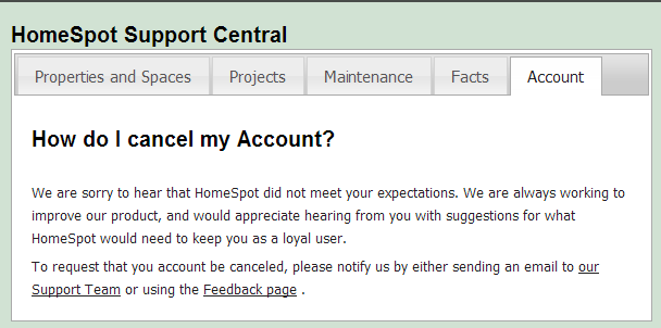
For the first four years since HomeSpot released, if a user wanted to cancel their membership, we asked them to email our Support desk or submit the request through our Feedback form. In our support pages, we had a simple FAQ entry to help guide the user:
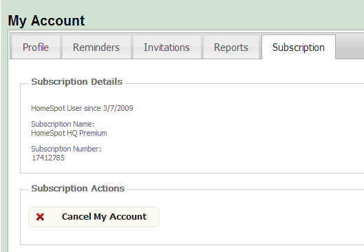
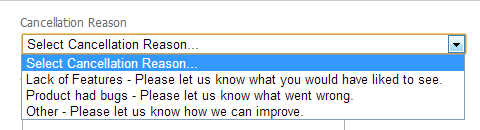
The hope was that if we had a more specific cancellation request form, we could get better feedback about how our product wasn’t meeting people’s expectations. So first, in the My Account page, we added a Cancel Account button.
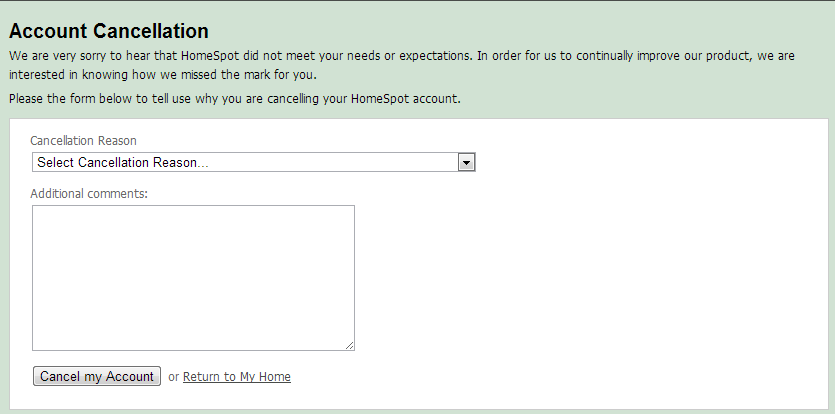
This linked to a new page where we solicited the reason for why someone wanted to cancel their account.
And then we created what we thought were legitimate reasons a user may have, each one asking them to provide us some feedback in the comments field.
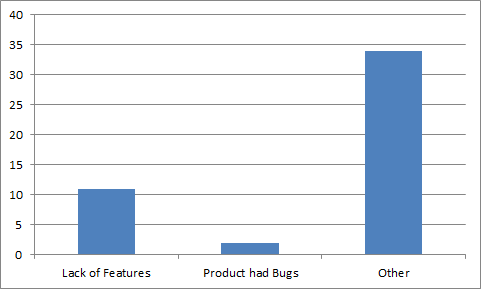
Since deploying this feature, we’ve had about 50 users cancel using this form. And I’ve learned that you have to be careful what you ask for. Feedback from users can illuminate opportunities; it also can sting a bit.
Here’s a breakdown of the reasons provided from those who have canceled their accounts.
Less than half of the users actually provided any additional comments. I chose not to make this field required, out of courtesy to departing users. So while they may have selected Lack of Features, they weren’t willing to tell us what they wanted, so I can’t help them.
Another set of responses I found interesting were those who complained about a missing feature that is actually in the product, meaning they couldn’t find the feature, or simply misunderstood it. For example, one user wrote
Works better if I do it myself on Google calendar instead of setting up a separate account.
HomeSpot has the ability to publish your home’s maintenance schedule to a Google calendar, which could have assisted this user. Another case was a comment that read
Option to delete reminders that don’t apply to my home. I don’t need to clean a garbage disposal since I don’t have one.
In this case, they must not have realized that the Delete this item button is shown when you actually view the item (rather than showing on the list view).
Most disappointing were the various forms of the comment “I don’t use it.” or “doesn’t meet my needs.” These are informative to the degree that any improvements we can make to foster user engagement will help draw users back to the product. Still, sometimes the truth hurts.
Improving User Feedback
There are lots of ways we may continue to try to get feedback from our users. One simple step will be to put links to our feedback and support pages on the Cancellation page, which may help answer some of the feature related questions or complaints.
Another approach may be to add a user forum component to our product, whereby users can post questions and get feedback from other users or our Support team directly. This approach would help make visible the questions and complaints from the user base and provide our responses to be globally available to all users.
With HomeSpot, we have always tried to listen first, then act, whether it is when adding premium features or updating our list of home maintenance tasks. Our users think of things that often never occur to us. But we’ll never know these ideas if we can’t effectively ask for and capture their input. And reviewing and adapting to those responses is critical to our ability to stay competitive.
So yes, asking for user feedback is worth it. You may be surprised at what you get.
There’s been a lot of emphasis lately about teaching kids about coding and programming. There is an entire course on Pluralsight on this topic. There’s a viral video from Code.org featuring celebrity CEOs, engineers, and even athletes, which opens with the following quote from Steve Jobs:
Everyone in this country should learn how to program a computer…because it teaches you how to think.
School districts around the country have rewritten their mission statements with more orientation towards “technical literacy” or “becoming citizens of a digital world”. And high tech breeding grounds like MIT have produced tools like Scratch that enable kids to create online, story-based games.
As a developer myself, I find myself often thinking about my six year old and the world in which she exists. She has on-demand access (via Roku) to her favorite movies and shows. She is drawn to our iPad like a moth to light. She walks through the grocery store chatting on a pink toy cell phone. Her world is awash with technology. It’s all she has ever known.
So when I ponder the question myself of whether or not to teach my kids how to program, I think Steve Jobs got it backwards. I don’t believe we should encourage programming in order to teach kids to think. I believe we should teach our kids to think, and let them apply that thinking to programming. Become a brilliant problem solver, then do it faster with the technology. The thinking comes first, then the coding, not the other way around.
The problem with a ‘programming first’ approach is that, especially these days, the answers to the problems come way too easily. We have the internet, for Pete’s sake, which is a repository of other people’s solutions to problems. Programming first orients the objective around completing the program, rather than placing the proper emphasis on thinking your way through a solution.
Here are a few of the practical ways I am trying to encourage problem-based thinking around our house:
1. As much as I can, when I do a home improvement project, I invite the kids to participate. In this context, we’ve dealt with topics like geometry, electronics, and physics. I don’t expect them really to remember (at this age) how we used the Pythagorean theorem to check if the raised garden boxes were square, but it exposed them to a method to solve a specific problem. If you’re really up to it, make them the stars of their own DIY video.
2. Put problems in the way of them getting what they want. I am in the process of planning a scavenger hunt to find clues to get the unlock code for the iPad. If they want to open it up, they have to solve the puzzle. The hope is that they tie together the motivation of getting what they want with the process of following the clues.
3. Talk to them about what makes the technology they love work. I am frequently asking them questions about how they think the games they play know how to keep score, or how the episode of the cartoon du jour ends up on the TV. Their answers will amaze you, and it creates a teachable moment to encourage them to think of their own game or create their own methods.
4. Try to not go to the Internet first when they ask a question. This one is hard, because it is so easy to just use the Google to get a quick answer. We have lots of books in our home, and as often as I can, I try to point to non-digital sources to satisfy their curiosity. It helps them learn to look things up, and prevents the addiction of instant gratification from taking hold.
As a parent, part of my challenge is balancing the exposure with the benefit. We try to limit our kids to a fixed amount of TV or iPad each day, knowing that without this limit, they would undoubtedly consume it morning, noon, and night. Yet I have to consider what worlds they would explore or create if they had unrestricted time.
Computers and coding changed my life. They became a passion, a career, a livelihood. They may or may not do the same for my kids. But far more critical than them following in my chosen career path, I want them to know how to face tough problems in life, and think their way through them.
The more I work with SharePoint, the less surprised I am when I see things that are unusual, bizzare, or even comical. Here’s today’s installation (emphasis mine):
WhatsPopularWebPart: Exception while retrieving data. Exception: System.ServiceModel.FaultException`1[Microsoft.Office.Server.WebAnalytics.ProcessedDataRetriever.DataRetrieverFailure]: The creator of this fault did not specify a Reason. (Fault Detail is equal to Microsoft.Office.Server.WebAnalytics.ProcessedDataRetriever.DataRetrieverFailure).
I’ve written before about inaccurate progress bars and offered my plea for meaningful exception messages, and I suppose in this error I get both my wishes. At the very least it’s brutally honest (though it would have been great to out the lazy developer by name).
In my presentation, I demonstrated how to incorporate the Bootstrap web application framework in to SharePoint master pages and page layouts in order to deliver a responsive browsing experience.
(Note: Unfortunately, when I switched from slides to the demo, and switched the display on my laptop from ‘Extend’ mode to ‘Duplicate’ mode, SnagIt didn’t pick up on the transition and the demo portion did not get recorded properly. Thankfully the code can be seen in the video up on the projection screen. If anyone has specific questions or wants code samples, just add a comment for this post or send me a tweet.)
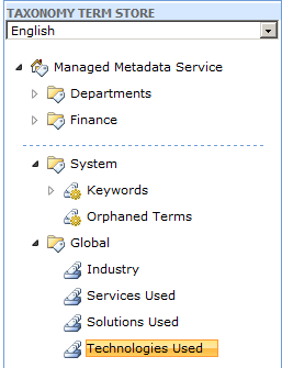
We recently updated a SharePoint branding solution to have a custom content type which included Managed Metadata fields.
When I attempted to deploy this solution to my development farm, however, I got this error when trying to Activate the feature:
Count not find the taxonomy group Parameter name: name Actual value was Global.
The cause was that I had not set up the Managed Metadata term store yet with the term hierarchy referenced in the custom content type. Once I created the Group and Term Sets to match our production environment, the deployment and activation succeeded.