Here’s a quick tip to provide a pseudo-mega-menu in SharePoint.
This CSS revision should work with the standard SharePoint 2010 and 2013 horizontal navigation menu that uses either Managed Navigation or Structured navigation.
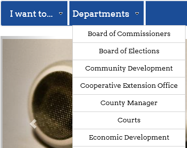
Let’s look at a normal presentation of the Global navigation menu. You can see if I have more than 10-12 items, I have to scroll the browser to see the full menu.
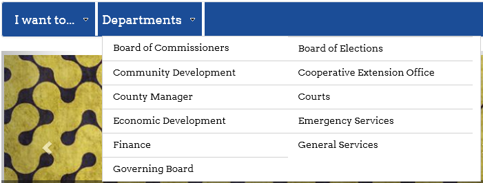
By simply using CSS to render the menu using multiple columns, we can now see the whole menu above the fold of the page.
Here’s the CSS to apply. You’ll need to put this in to an alternate CSS file or otherwise reference it through your custom master page.
/*two column nav dropdown - only in wide view*/
@media (min-width: 768px) {
  #topnavbar .nav li.static > ul.dynamic {
    text-align: left !important;
    width: 550px !important;
  }

  #topnavbar .nav li.static > ul.dynamic > li.dynamic {
    display: inline-block;
    list-style-type: none;
    float: left !important;
    width: 49% !important;
  }

  #topnavbar .nav li.static > ul.dynamic > li.dynamic:nth-child(odd) {
    clear: left !important;
  }
}
A few additional comments:
- In this specific case, I am using Bootstrap, so that is why the .nav class indicator is included in the selector. It is also why I wrap this CSS block in a media query so that the multiple column display only is applied in the largest views of the page.
- You’ll notice that it renders the menu items left to right, not down the first column, then up to the second column. This is simply an easier approach since we never know how many menu elements are present.
There are other Mega Menu approaches that incorporate images or multiple menu hierarchies. However, if you just needing to compress the menu above the fold, this is a pretty efficient method.


Leave a Reply