I’ve never been one who particularly cares, or even really notices, the font I use when coding. I’m happy to let someone else make that decision for me. But today on HackerNews there was not one, but two articles about so-called ‘developer fonts’. Suddenly, typefaces for code became a curiosity I had to explore.
The two options discussed were Anonymous Pro – a fixed-width font designed for coders by Mark Simonson, and Hermit: a font for programmers, by a programmer by Pablo Caro. We’ll review Anonymous Pro in this post, then Hermit in another.
According to its designer, “Anonymous Pro is a family of four fixed-width fonts designed especially with coding in mind. Characters that could be mistaken for one another (O, 0, I, l, 1, etc.) have distinct shapes to make them easier to tell apart in the context of source code.”
Faced with new options, I realized I needed some criteria. What was going to make one font better or worse for coding?
- mono-spaced – this is the code-writing font table stakes. It’s hardly a criteria because it is so assumed. However, we will look at how uniform the character size and spacing is, and how that impacts readability.
- presentation quality at 1024×768 – needed for viewing on a projector as well as in screencasts
- simplicity and style
Installing the fonts and setting up Visual Studio
After downloading and unpacking the zip file for Anonymous Pro, installing the four variants (Normal, Bold, Italic, Bold Italic) in Windows is as simple as right-clicking on each .ttf file and selecting Install.
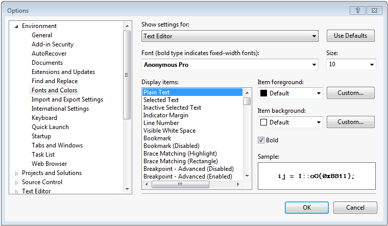
We can then change Visual Studio to use the alternate font. This setting is changed in the Tools | Options dialog on the Fonts and Colors page, as shown below.
It is important necessary to restart Visual Studio after making this change. (It was for me at least!)
Everyday Use
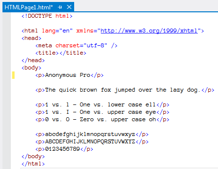
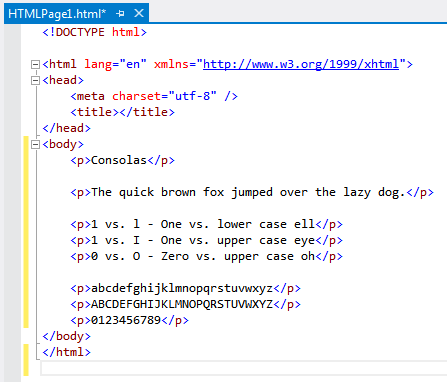
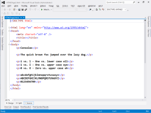
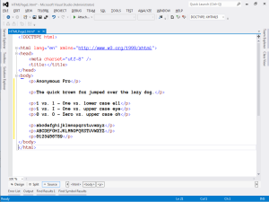
Now we’ll see how this new font shows by creating a new html page. For reference, here is the Consolas 10pt code file first, then Anonymous Pro 10pt.
A few details jump out right away.
- Both fonts cross the zero to distinguish it from the letter O.
- Both fonts distinguish 1 from l by angling the top stroke.
- The lower case ‘s’ in Anonymous Pro appears a bit ‘squished’
- I like the extra strokes on the Anonymous Pro upper case T and Z, but the T seems compressed.
- The Anonymous Pro 6 and 9 nearly represent a zero due to the size of the circular stroke.
- I generally prefer the style of the Anonymous Pro lower case ‘g’.
Viewing on the big screen
It’s not uncommon to only have 1024×768 resolution when using a projector on a large screen. Let’s see how Anonymous Pro stacks up when viewed at this lower resolution.
Scott Hanselman recommends Lucida Console 14pt bold for presentations. As such, I will use 14pt bold as our baseline. Here are the screenshots (click on the image to view the full 1024×768 size). Again, Consolas 14pt bold first, then Anonymous Pro 14pt bold.
The larger size and bolding definitely has an impact.
- Anonymous Pro lower case ‘e’ is quite compressed, almost resembling a crossed ‘o’
- However, the lower case ‘s’ does appear more even at this font size.
- The extra strokes on the upper case T and Z are much more visible, and the T does appear more balanced.
- 6 and 9 are a bit more clear, but the razor thin separation between body and tail still results in them nearly resembling a zero.
My Choice
At first glance, I do like the Anonymous Pro typeface in its general style and flourish. I also recognize there are lots of other factors that influence text rendering on a monitor, at both the hardware and operating system level. Still, unless I want to code at a baseline of 14pt, the smaller rendering of Anonymous Pro seems uncomfortable and constrained. The designer eludes to this condition in the Usage Notes.
I will say, having gone through this effort, that my awareness of how a font affects code files is heightened. I will leave Anonymous Pro in force for a while to further get accustomed to it in daily use.
Leave a Reply